We are really proud and happy to come out with an identity in a form that properly stands out for us. Design Bureau Izvorka Jurić it’s behind the branding and design of the BITE ART and today we’re introducing it.
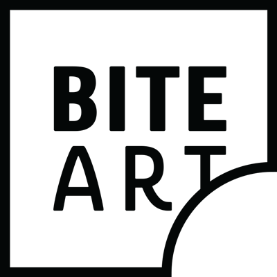
The brand and the edible art project logo is in the form of the pepper biscuit, which in graphic terms looks like a frame, and with the intervention in the form of the “bite”, literally conveys the name of the product – bite art. The idea of the brand is also conveyed on the package that will be presented here soon, while its graphic form can later be used as a picture frame for the featured artwork.
The brand and the edible art project logo is in the form of the pepper biscuit, which in graphic terms looks like a frame, and with the intervention in the form of the “bite”, literally conveys the name of the product – bite art.
“The biggest challenge while branding the BITE ART product was to find the right balance between art presentation and commercial market strategy. Since the main idea of the whole project is to make art more popular and bring it closer to a wider range of people, it was crucial to tell the story about the project as well as to make its idea far-reaching. At the same time, it was necessary to put the product in a noticeable spot, give it a needed priority and communicate it as a distinguished “treat” on the market – because this product is a socially engaged project.” – said Izvorka Jurić, creative and art director of Design Bureau Izvorka Jurić that signs the branding and design of the BITE ART packaging.
DESIGN STUDIO: Design Bureau Izvorka Jurić
CREATIVE and ART DIRECTION, DESIGN: Izvorka Jurić
SLOGAN: Jelena Gvozdanović
DESIGN: Stela Kovačić


